A Few Stuttering Logos
Below are logos from various stuttering associations and programs, and the stories behind some of them.
|
|
When writing to Anders Lundberg, a logopedist in Sweden, I commented on the woodpecker logo that appears on the homepage of Svenska sidan am Stamning He explained, "The woodpecker logo was chosen some ten years ago when a group of people involved with teens, produced a video on teenagers and stuttering (the first one in the world, I believe). We laughed a little about a kind of a word game (it doesn't make sense in English). The word "hackar" means "pecking", but also "stumbling" - it all depends on the context. The word "stammar" means both tree trunks and stutters. The letter "�" in speaking vocabulary is an abbreviation for "and" at the same time it is an old word for "on" or "at." So, "hackar � stammar" means both "pecks on tree trunks" and "stumbles and stutters". Hence a woodpecker for a stutterer. Swedes think this is very funny indeed!" |
|
|
Mike Hughes, executive director of Canada's Speak Easy Inc. explains - The main outline of the logo resembles a piece of a jigsaw puzzle. This represents the "question, problem, or contrivance difficult to solve or a situation difficult to resolve," according to the dictionary definition of a puzzle. Surely anyone knowledgeable about stuttering will agree that this definition suits stuttering perfectly!
The shape of this piece of a jigsaw puzzle has been shaped to resemble the outline of Canada, the home of Speak Easy Inc. "Artistic liberties" have been taken with the outline to ensure that it resembles both Canada and a piece of a puzzle. Within the puzzle lies the Canadian flag to show our home. The bars and maple leaf of the flag are printed in red where circumstances allow. Like the pieces of a puzzle, we must all work together to give stutterers as much information and advice about stuttering as we can find. Articles published in one group's newsletter often is reprinted by another group. Just as one piece of a puzzle is incomplete standing alone, so also is one organization for stutterers. The outline of our puzzle indicates that we are willing to work with other groups and hope that they will work with us to the betterment of all stutterers. Just as one piece of the puzzle does not present the whole picture, so our stuttering is only one part of our being. There is much more to us than our stutter and we should be careful not to allow it to dominate our life. Life with a stutter may be difficult at times, but it is only part of who we are. |
|
|
South Africa's Speakeasy Society
Marlene Green shared that the Speakeasy logo was designed to be an integration of the following concepts: The South African flag. The discontinuity of stuttered speech (the progression of dots leading up to the flag). The people who stutter (the same dots). The fellowship of people who stutter coming together at the 5th World Congress in South Africa and emerging in a united way (the arrow exiting from the flag). |
|
|
Malbjorg, the Stuttering Association in Iceland.
Benedikt Benediktsson wrote that "the logo we have chosen for Malbjorg is taken from a book about one of our country's best known places, Reykholt, which was the home of Snorri Sturluson. Snorri played a large role in the politics in the 13th century, but more important, he was the greatest saga writer and the most famous of the Icelandic sagas are written by him (The Edda and Heimskringla). In the old saga manuscripts, that were written on leather, there were drawings to make the scripts look better and add to effects. One picture from some of the old scripts that was in this book was of an angel fighting a dragon. We took the picture, removed the wings from the angel and that gave us a picture of somone killing a dragon by putting a spear in its mouth, a good symbol of our figthing with the stuttering. I don't know actually the origin of the picture, but it comes from this old handwritten book, probably from the 14th to 16th century. With a little editing, it has become a symbol of our struggle with stuttering." . |
|
|
Demonsthenes Nederlandse Stottervereniging - Netherlands
Hans Baas wrote, "Our logo is based on two things. The repeating D points to stuttering and forms a wing like that of Greek statues. And Demosthenes was a Greek philosopher." . |
|
|
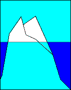
Foreningen For Stammere I Danmark Henrik N. Jensen, chair of The Association for Stutterers in Denmark, wrote, "Our logo is the stuttering-iceberg. We try to show that you can see and hear only 1/10 of stuttering. The other 9/10 is the hidden part of stuttering (shame, fear, sense of guilt and inferiority complex)." |
|
|
The Stuttering Foundation of America logo was designed by the neice of Jane Fraser's boss in London in 1972 where she was working part-time at the Franco-British Society. She was an art student and Jane showed her the squiggly line and asked for her help. The artist is now living in Rome where she designs full-time. The printers along the way have made a few minor changes. |
|
|
Norbert Lieckfeldt wrote, "the logo of the British Stammering Association was adopted in 1995 with the re-launch of the Association under its new name (formerly the Association for Stammerers). The quotation marks refer to speech as being the issue the Association is concerned about. However, they are also arranged in such a way that they could be viewed as two heads, smiling at and talking to each other. Underneath this, you find the words "The British Stammering Association", with the word "Stammering" in red, to highlight the cause (seeing that we will probably never be well-known enough for our logo on its own to be recognised by the general public). The colour scheme (red and blue on white) refers to the Britishness of the Association, going back to the colours of the Union Flag." |
|
|
National Stuttering Association - logo designed by Bill Ninelman |
|
|
The logo to the fore-runner to the NSA, the National Stuttering Project's logo was also designed by Bill Ninelman, who shared, "I felt the NSP needed a contemporary, streamlined look, something that would show what we are - a vibrant, important self-help organization that so often helps peoples' dreams of leading a more fulfilling life come true. The graphic of the rainbow coming into the words "National Stuttering Project" I feel symbolizes this idea of having dreams and those dreams of support for stuttering coming true. The closeness of the letters of the type was also done to give a feeling of the closeness of stutterers and the organization in general. I also wanted to give the NSP a logo that would pique the interest of other companies, corporations and organizations, many who give charitable donations, therefore helping the public relations and financial well-being of the organization. I feel I achieved this through a corporate feel to the logo (cleanness, simplicity and colors) which will work in that setting." |
|
|
British Columbia Association of People Who Stutter - Canada.
Don Hermansen who designed the BCAPS logo, wrote, "The three colored lines in the BCAPS logo, are meant to convey a couple of ideas. They flow like wriggly ribbons or tapes that represent our speech patterns that are sometimes frustrating and disruptive, and sometimes smooth and flowing. They are silhouettes of faces speaking and represent the people of our association - speaking out for themselves and others who stutter." |
|
|
Friends: The Association of Young People Who Stutter The FRIENDS logo was designed by Mona Toft (a graphic designer and mother of a young man who stutters) and John Ahlbach. The logo shows the palm print of a child as it would appear if the child had put his or her hand in paint and touched a wall, within a larger one to reflect a sense of parents being right there with the children, the idea that stuttering is a probelm that grown-ups and young people share, the idea that we grown-ups (and perhaps older siblings, too) want to "hold their hand" through the fearful moments of their stuttering experience, and, last but not least, it obviously speaks our name, FRIENDS. |
|
|
The (former) Birch Tree Foundation Woody Starkweather wrote, "The logo of the Birch Tree Foundation is not a birch tree, as you might imagine, but a tri-colored triangle. The three sides and the three colors represent the three important aspects of our approach -- awareness, acceptance, and change/choice. The triangle is closed because a person keeps cycling through these steps as they recover. Also, the style of the triangle is child-like (It is supposed to look as though it was drawn with a crayon) because of the importance for adults of working on the experiences of childhood. Finally, we chose earthy colors because we believe the process of recovering from stuttering is a natural process that the person who stutters is already in. We only witness and assist." |
|
|
Nigeria Stuttering Association The name S.A.N is an acronym which depicts Stuttering Association of Nigeria The Map simply signify the geographical location of Nigeria on the globe The First Green colour to the right depicts fruitfulness on the path of stutterers The Second Green colour to the left depicts strength The White colour at the center means light and hope The Black strokes signify freedom from stuttering The Motto says: 'SPEAK CLEAR' The notion was birth by the S.A.N Director Mr.Akintunde Adeyemi and artistry by Prince Deji Omirin. |
|
|
The logo for the American Institute for the Management of Stuttering, located in Grafton (Milwaukee), Wisconsin, is a broken arrow to the left to indicate the initial phases of stuttering, the uncertainty, the hesitance, the unsettled being. From there the arrow becomes less broken and more solid with a definite movement to the right. This indicates what could happen with therapy, self-examination, support from significant others, etc. |
|
|
ACB - Action Against stuttering, the Burkina Faso stuttering association. The meaning of our logo is : Sonorous waves: the waves are the symbol of language. Here, in the beginning, waves are normal and in the end they are disorderly; that means there is language trouble. The waves symbolize stuttering. The head of man and woman: both join, mean that stuttering concern men and women and therefore all the population . The white and black color of heads mean stuttering concerns all the races and ethnic. The colors - ACB in Black, means that ACB is based on suffering and sadness of People who stutter in order to lead them towards light and hope (The yellow color of the background ) in a perennially and happiness environment (The green color of the frame). The Logo of ACB is put on a strong slogan : "Stuttering is not a fatality" This slogan encourages people to join us. This logo was conceived By Dr Moussa DAO with the artistry done by Tiekoura TRAORE |
|
|
Bundesvereinigung Stotterer-Selbsthilfe e.V.) - The German Stuttering Association . |
|
|
Pacesetters - Australia |
|
|
Association Vaincre le Bégaiement |
|
|
Association Parole-Bégaiement |
|
|
Asociación Argentina de Tartamudez |
|
|
International Stuttering Association |
|
|
China Stuttering Association |

