Help the ICA Choose a Logo
 |
About the presenter: Kathleen Scaler Scott, Ph.D., CCC-SLP, is an Assistant Professor in the Department of Speech-Language Pathology at Misericordia University and a Board Recognized Fluency Specialist. She has been a practicing clinician for over 15 years. Dr. Scaler Scott has authored and co-authored several articles and book chapters in fluency disorders, and is co-editor of the forthcoming textbook, Cluttering: A handbook of research, intervention, and education with Dr. David Ward. She is Coordinator of the International Cluttering Association. |
Help the ICA Choose a Logo
by Kathy Scaler Scott
from Pennsylvania, USA
Help the International Cluttering Association Choose a Logo The International Cluttering Association (ICA) was founded in May 2007, with the mission of helping increase awareness and education about the communication disorder cluttering. Though the ICA is approaching its third birthday and has grown tremendously in membership, it is still without a logo to officially represent it. The ICA is currently working on developing by-laws to become an official organization, and is in need of a logo. During its first year, several ideas for logos were submitted. Due to logistical issues of a newly developing organization, the ideas were never moved forward into an official logo contest. Well, just as with this conference, we feel it is about time to choose a logo for the ICA! So, we are asking for your input. Below are either actual logos or logo ideas submitted to the ICA. Before you review the logos, please first review the principles the ICA executive board was hoping a logo would represent.
Guidelines for the logo contest:
Logos SHOULD include the following features:
- Be bias-free as far as definitions or positions about cluttering
- Be easily recognizable
- Apply to all involved: consumers, researchers, clinicians/logopedists, educators
Logos SHOULD represent the following concepts:
- International Focus
- Areas we represent: Consumers, Researchers, Logopedists/Clinicians, Educators
- Increased awareness and education
Logos SHOULD NOT include the following concepts or features:
- Definitions of cluttering
- Any information that may become outdated with time
- Language that is confusing to the nonprofessional
- Colors that clash with the website colors
We are asking that you:
- Take a look at each logo and/or idea for logo below.
- Click on "questions/comments"
- Post a comment regarding your thoughts about logos or ideas you feel have particular merit to consider for the organization. Please be specific about your reasons for those to consider. You do not need to sign your response if you prefer it that way.
We thank you for your help, and look forward to your responses!
LOGO IDEA ONE:
Four puzzle pieces with different colors. Three of them linked together containing the letters I C and A. The fourth piece is by itself and contains the word cluttering.
LOGO IDEA TWO
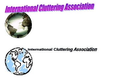
LOGO IDEA THREE

LOGO IDEA FOUR
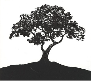
ICA Board: I am forwarding a sample "logo" (of a healthy tree) with this narrative. Attached is also an example of a tree that's not in such good shape, although we can probably come up with a better depiction that reflects a tree lacking symmetry, clarity of lines of the trunk and branches to reflect analogous symptoms of cluttering.
A concept for the ICA logo:
a. the logo of a tree
b. the type or architecture of the tree to be determined based on the following ideas:
- THE TRUNK AND MAJOR BRANCHES IN BOLD (to represent the idea that effective communication is achieved when we first have a clear, hierarchical and well-sequenced idea of the major points/branches to be conveyed): the communication of PWC often does not reach this ideal
- THE SMALLER BRANCHES AND LEAVES (to represent other subsidiary "nodes" of communication such as the planning of syntax, the selection of best words to encode meaning, the layout of the phonological patterns of the message): the communication of PWC may be too rushed to encode the smaller branches in an organized and cohesive manner
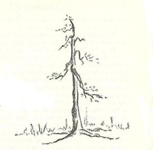
Clinical implications if the above premises of effective communication are not fulfilled:
- the PWC may literally lose the forest for the trees (or, more aptly, the tree for the leaves) in encoding the message
- "getting stuck" in the nuances of the message (as exemplified by incomplete words and revisions) is analogous to focussing on the capillaries of the leaves when the major arteries of the tree have not unfolded); "getting stuck" in the convoluted capillaries is analgous to the linguistic mazes discussed in the literature on cluttering
- PWC may have a tendency to go off on related but unnecessary tangents (as exemplified by the many leaf clusters of the "tangents" as other parts of the tree are bare) so that the structure of the tree/conversation is skewed, becomes a "big blob," and is difficulty for the listener to follow
- The nodes of a tree represent "decision branches" (analogous to decision trees in schematics) that a speaker needs to process efficiently and accurately in order to communicate effectively
Other implications of a tree logo:
- Trees are universal and have international appeal
- Our newsletter is likely to "go green" to help with the environment
- Would probably not be difficult to find a tree icon in freeware
- Focusing on the major branches of the message first, as depicted by the trunk and major branches of the tree, is graphic so helpful to consumers and their family; as such the icon may provide a positive note for treatment because the analogy is intuitive
- Other analogies that can be discussed with clients: the need for sun, water, nutrients to nurture this tree (representing elements of therapy such as regular practice, help with monitoring and modulating of cluttering behaviors first by the clinician); when these elements go awry, the shape of the tree can lose symmetry or we may lose an important branch (of the message) because of neglect; when there is a strong gust (analogous to the urge to talk fast) the tree loses its branches and leaves (analogous to dropping off phonemes or words)
- The aesthetics of a tree, like the "aesthetics" of pragmatics, can influence how a message is perceived; when the PWC does not monitor the effect of his communication on the listener, conversational breakdowns occur.
LOGO IDEA FIVE
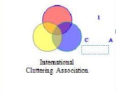
The design is a ven diagram of three circles
- Top circle red with I in circle
- Lower left yellow with C in circle
- Bottom left royal blue with A in circle
Below the design
- TOP line International
- BOTTOM line Cluttering Association
In thinking about the design I considered the following points.
- Cluttering is overlapping and encompassing
a. Venn diagram - Cluttering can encompass a wide range of ideas in a small area.
b. Overlapping circles with blended colors
c. All colors of the spectrum - Design should be representational and symbolic rather than comprehensive and detailed
d. Venn diagram and colors of the spectrum - Have some conciseness to the design
e. Initial I and C and A, one to each circle - Notification of the name of the organization
f. Name of the organization below the circles. - Representation and space consideration
g. Non-linear graphic of name
h. First line International
i. Second line Cluttering Association - International considerations
Colors represents the entire rainbow. In a similar way, Olympic flag circles reportedly contain a color from the flag or each country represented. - Size considerations
j. Design can be enlarged or compressed and continues to retain basic look. The logo guideline suggest 150 x 150 pixels.
LOGO IDEA SIX

LOGO IDEA SEVEN
An iceberg floating in the ocean (famous Deso Weiss picture) with the letters ICA on the tallest peak, and the word cluttering on the part below the surface. Other peaks could contain the words: International, Volunteers, Clinicians, Researchers. This may not be possible in a small 1.5 inch logo!?
LOGO IDEA EIGHT
A rainbow running from left to right with in three of its colors the words "International" "cluttering", "association".
LOGO IDEA NINE:
Dave Daly's umbrella with under the parts that point down ICA, Volunteers, Clinicians, Researchers, Persons who Clutter.
SUBMITTED: March 14, 2010

